Monday, December 9, 2013

Superior Hiking Trail - Critique 5


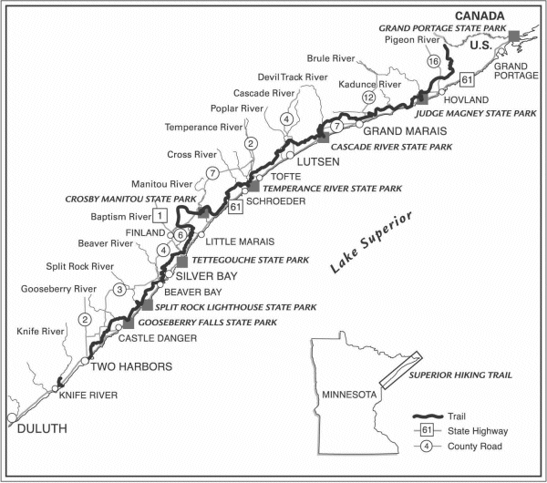
The Superior Hiking Trail is listed as one of the best hiking trails in the country.  It is over 275 miles long and extends from Duluth to the Canadian border.  This is the official map of the Superior Hiking Trail.  The first thing I notice is that it is not a color map, so this makes it tougher to see the figure-ground.  The darker gray of the land is visible though over the stark white of Lake Superior.  The legibility is good even with all the labels I am still able to read all of them.  Clarity is also surprisingly good with so many labels.  It appears that cities are in all caps and state parks are bolded.  Rivers are labeled smaller and are on the left side of the map.  I also like how they included an image of the location of this trail in Minnesota.  Balance is good in this map and the locations of labels are consistent.  Overall I think this is a well thought out map that shows mostly what you would need to know to hike the trail.  If they included locations of trail heads and campgrounds that would improve the map.

Middle Earth Map - Critique 4


Next time you venture into Middle Earth you may want to bring this map! Well... maybe you won't be going there anytime soon.  This map of Middle Earth doesn't really have much as far as figure-ground goes, but I still feel like it manages to look ok.  The legibility of the map is good, the larger the area is the larger the label is (even if you can't pronounce it).  The clarity of the map is good and there is no overlapping on labels. The balance of the map is a little off as most of the mapped area is on the right. Having the title in the bottom left helps balance it out, but is in a bit of an awkward place. The map was well thought out though and looks very nice. The color of the maps may seem a little dull but I think that's because they are going for the look of an old map or page of a book. 

Carson Park Map - Critique 3

This map of carson park was made by the Chippewa Valley Museum.  I really like this map because it is pretty detailed and this is a place I really like to visit (two blocks from my house).  The figure-ground in this map is very good.  It has a nice contrast from the blue water to the green land.  The Legibility of the map is ok, I would probably change the color of the numbered circles so that they don't blend in to the dark colored trees as much.  The clarity of the map is really good.  One spot it could be better is on the road that cross from Lake Street into Carson Park.  If it was a little wider using displacement I think it would look better.  The balance of the map is good, there isn't an uneven placement of things.  Lastly the Visual Hierarchy of the map.  The map maker should have included a scale.  I also really like how trees were included in the map.  This gives it a more realistic look and helps take up more space.

U.S. Lynchings 1882-1968- Critique 2


I want to start off by saying this is a pretty poor excuse for a map.  The figure-ground is ok, but that is about all for this map.  Legibility is pretty poor and the way she spaced her name and her sources is pretty weird.  The clarity of the map is also bad.  To make it easier to see she should have used circles instead of squares.  The image seems to be very pixely which doesn't help your map look very good. As far as the balance of the map it would look better if she kept her data source and name together.  Otherwise I think the balance is ok.  The visual hierarchy of the map is where she needs improvement.  This map was not well thought out.  The projection of the United States is pretty poor, and she left out Alaska.  In her note under the legend she says she doesn't have data for Hawaii or Alaska.  Why would she include only Hawaii (very distorted) on the map then? 

Wednesday, December 4, 2013

Lutsen Mountain Trail Map- Critique 1


This is a map of Lutsten Mountains Ski and Snowboard Resort.  I went here a couple of years ago with my friends family on vacation.  This map uses a landscape panorama map format, which Austrian painter Heinrich Berann made famous in the 1900s.  This map has pretty good figure-ground, using the natural colors based on a realistic image of what the mountains look like.  The legibility of the map is ok.  There are some smaller paragraphs of wording on the sides and in some of the legends, but I feel the cartographer did the best with the space he had available.  Also, the trail map is easier to read when you are holding a hard copy of it, not just looking off of a computer screen.  The Clarity of the map is consistent with the quality of the rest of the map.  There are good borders on the different images in the map and they do not overlap over anything important.  Balance is very good on this map.  The way it is layed out works well with what it is mapping.  There are images of each seperate mountain, the lodge area, and one big image encompassing all of them.  This map's visual hierarchy combines all of the other essentials of map design and overall I beleive this is a quality map based on how much needed to be mapped. 

Racial Populations in Denver, Colorado

Racial Populations in Denver, Colorado by DakotaDorn

Denver, Colorado is the sight of my newest map.  In this assignment I was to make four identical maps of downtown Denver and keep them at the same scale.  I then added data of different racial populations to each map.  Each map had to have a different color pattern, and the class breaks had to be the same for all of the maps.  This is the part that proved tough while working on this.  The reason is that Asian populations in Denver are very small so finding a class break that worked for all races was tough.  In the end I picked one that showed the other three well, and doesn't show much from the Asian population.  By not showing much though I am saying that there are not many that live there, so the data is still getting shown.  Another area of this map that was challenging was fitting all four maps and there legends in the document.  After changing fonts, adjusting font sizes, and scaling down the sizes of my maps I was able to make it work.

African American Population in the United States

African American Population in the United States by DakotaDorn

This is a proportional symbol map.  Unlike a graduated symbol map, this one shows exact values and not relative.  ArcGis makes adjusting the size of the minimum and maximum values very easy and even displays the size of each before you change the setting.  There are many adjustments that ArcGis allows you to make on these types of maps, but I am still not to the level where I know everything yet.  With some practice and maybe some light reading I might be able to figure out the vast unknown which is ArcGis. 

U.S. Population between the Ages of 18 and 21

U.S. Population between the Ages of 18 and 21 by DakotaDorn

This was my first ArcGis only map that I have made.  After doing choropleth mapping on Adobe Illustrator and then learning how to do it on ArcGis, it is so much easier!  ArcGis allows you to make a choropleth map in a mere minute or two instead of a couple hours.  Doing a choropleth map of the entire country by county on Illustrator would take a very long time. Another cool feature is the ability to change the class breaks on ArcGis very quickly without having to do any calculations on Excel. The legend on this map was also very easy.  All that needed to be done was click a button and then adjust the settings for your legend and what you wanted displayed.  I didn't really have too much trouble making this map, it was more of just figuring out how to use ArcGis that took time.

Thursday, November 21, 2013

Gun Ownership and Gun Murders by State- exercise 8

dorndd_exercise8 by DakotaDorn
dorndd_exercise8, a photo by DakotaDorn on Flickr.

This map also displays data that interests me.  In this map I am comparing gun ownership in a state, to gun murders in that same state.  To do this I first made a choropleth map of the gun murders (per 100,000 people), the darker the red the more murders.  Then I made a graduated circle map of gun ownership, where the bigger the circle the more gun ownership in that state (per 100,000 people).  The message I was trying to get across with this multivariate map is that the states that own more guns committ less gun murders.  I find there is a positive coorelation between the two.  The biggest difficulty I had with this map and something I would change if I could go back, is the size of the biggest circle.  I wish the map would show a little more variance in circle sizes, but I feel it still gets my message across. 

Number of State Parks by State- exercise 7

dorndd_exercise7 by DakotaDorn
dorndd_exercise7, a photo by DakotaDorn on Flickr.

I recently got into camping and backpacking and because of that I scour the internet looking for good places to go.  This assignment gave us the freedom to choose our own map data.  Most of the places I have been looking to travel to have been state parks, so it only made sense that I map them!  I found data of state park numbers per state online and went to work.  The process of making a graduated symbol map is relatively easy and this type of map shows the data well I think.  The biggest issue I ran into while making this map is deciding how big I wanted my biggest circle to be.  After many attempts I managed to find a size that allowed my smallest circle to still be visible.  displaying the data in the legend was also easy as all I did was take circles off the map and put them in the legend.  I think the reason I really enjoyed making this map is because I mapped something that interests me.

North Carolina Residents Claiming American Ancestry by County- exercise 6

dorndd_exercise6 by DakotaDorn
dorndd_exercise6, a photo by DakotaDorn on Flickr.

My first Choropleth map! To make this map we used Excel to calculate class breaks for our data.  Each way of calculating class breaks resulted in a different map.  Two of the maps represent the data in percentage and two of the maps have absolute data.  As you can see all four are different because of the different methods.  The hardest part of this assignment was figuring out which county was which.  by pulling up a map of North Carolina counties on the internet and comparing it to this one in Illustrator, I was able to find where each county was located.  Color choice was easy because I used Cynthia Brewer's "colorbrewer" website for selections.  I find Choropleth maps to be very effective in displaying data, and it makes it easy to see the results.  

Lanesboro, Minnesota Map- exercise 5

dorndd_exercise5 by DakotaDorn
dorndd_exercise5, a photo by DakotaDorn on Flickr.

This was probably my favorite assignment that we did this semester.  To make this map of my hometown I first used ArcGis to make a basemap, which I then dropped into Adobe Illustrator.  Once I had the base map in Illustrator I then used the pen tool to trace the roads, rivers, parks, exedra throughout Lanesboro.  One neat tool that I discovered was the smoother tool, which allowed me to make my roads not as blocky and more flowing.  After finishing all of the features I then made a green rectangle that covered the entire document and deleted the base map.  This was the first project where we were in charge of making the map basically from scratch.  It was challenging but I found it very fun to be able to create something like this.  This exercise also greatly expanded my Adobe Illustrator knowledge and allowed me more artistic freedom for my map.

Eau Claire Bike Route- exercise 4

dorndd_exercise4 by DakotaDorn
dorndd_exercise4, a photo by DakotaDorn on Flickr.

For this assignment I had the opportunity to use a GPS device to either "track" or "point" data on a base map of my choice.  I decided to take my GPS on a bike ride through Eau Claire and have it track my movement.  After gathering the data I then uploaded it to a data software, and from there into ArcGis.  I then dropped in a base map, and there you have it a map of my route!  I was very surprised how well the device was able to track me on my bike, even though portions of the trip were through dense tree cover.  Even in these times the information was still delivered, and my location tracked.  The ease of use for the GPS, along with the results you can achieve are reasons I wish to do more with this technology in the near future, like bring a GPS with me on a hiking trip. 

Projections of South America- exercise 3

dorndd_exercise3 by DakotaDorn
dorndd_exercise3, a photo by DakotaDorn on Flickr.

To complete this assignment I was to overlay ten different projections of South America on top of each other.  By doing this one would be able to see the different type of distortion each projection shows.  All projections had to be positioned so that 60° W was there central meridian.  Using ArcGis to make the projection and then cutting away the other locations on the globe I was able to then paste the outline of South America into an Adobe Illustrator document.  After repeating this process for each projection and changing the colors of each outline I got the above image.  This project was tough in some ways while I was completing it.  The first is that it is crucial that when changing the meridians you followed the directions exactly.  Another difficulty with this project was finding ten colors that allowed you to see all of the projections.  I had a lot of fun with this assignment and it was a good intro into ArcGis.

Africa Political Map- exercise 2

dorndd_exercise2 by DakotaDorn
dorndd_exercise2, a photo by DakotaDorn on Flickr.

For this exercise I was tasked on creating a political map of Africa that included all country labels, as well as labels for main terrain features.  Some examples of those features are rivers, lakes, mountains, and gulfs. With that we also had to use the five fundamentals of map design to make an ascetically pleasing map.  Finding colors that went well together for both the countries and for the figure-ground presented a challenge.  Also, some of the labels were especially tricky to place and required a significant amount of thought and trial and error.